Friday, 3 June 2016

Modernism


Modernism 


Following the first world war a philosophical movement erose, called modernism. Modernism was a reaction to a number of technological developments and a sudden change which the western society experienced during the industrial revolution and after the first and second world war. Europe was traumatised after the war, it needed change. Modernists grasped this opportunity to forget historical design or rather reinterpreted. One of the pioneers of modern architecture once stated three simple but yet effective words that define the movement, which was “less is more” (Mies Van Der Rohe). These words will move on to be one of the key principles of modernism. Many designers and Architects were influenced by this movement and started emphasising on the essential components such as space, lines, light and sound.


Ludwig Mies van der Rohe was a German architect who is well know for his famous quote that defines modernism 'less is more', he is widely known as a pioneer together Le Corbusier, Walter Gropius and Frank Lloyd Wright for modern architecture. As stated in the intro many modernist felt the time for change after the first world war, one particular modernist was himself, a man who created an influential twentieth century architectural style that innovated many artist and designers including myself. His buildings featured simplicity and clarity as he often used modern materials such as industrial steel and glass. He called his building skin and bones as he frequently applied minimal framework to his structures, he emphasized on balance and free open spaces.   


The Barcelona Pavilion is one of the great examples of Rohe's work. It was inaugurated by the king of Spain in 1929, It was built for a fair and demolished nine months later as the fair ended. It was later rebuilt in 1929 by a group of Catalonia architects and was funded by a German Republic. 
The Pavilion demonstrated Germany's will to show to the world a new reassuring image of their country after the war. Its design clearly defines modernism, simplicity, open and nothing to hind. It was also a show house to show the new style of Germany's new building style, it was also built with German industrial products. In this pavilion and in many other works he made it highly evident he was a admirer of ancient Greek architecture as he undermines the contrast between the greenery around the building and the geometrical buildings he installed. Another evident feature that Mies was highly influenced by ancient architecture is that the pavilion is purged and elevated from the ground by a solid base block. This style was used in ancient temple podiums. 
The pavilion is designed in a modern, functional manner, but still creates beauty with its simplicity. another factor that helps it be more pleasing to the eye is the variety of materials he uses in this building. He uses a variety of marbles, travartines and also different colored glass. On the other hand he uses pebbles to create contrast with its smooth surroundings. Although he applies all these materials to it he still manages to avoid the busy atmosphere, the reason is because he uses natural colours and avoids any vibrant colours. 
As a school assignment we are constructing our own Barcelona pavilion using 3Ds Max, we also try to apply the same exact materials that are visible in the real structure. Below is a visual of the pavilion:


Architecture and the Catholic Curch in Malta

Modernism and the Catholic Church

Early promoters of modernism such as Louis Sullivan, Frank Loyd Wright and Otto Wagner rejected traditional and historical artefacts in their designs. As modernism grasped its hands around society the church also felt the need to break with the past. Due to the promoter’s rejection, traditional motifs in sacred buildings had to be subtracted and abstracted .
In some particular cases the Vatican felt that modernist architects who designed churches were going overboard. This sort of criticism dragged till this very day were the head of the Vatican’s pontifitial council for culture compared these newly designed places of worship to museums. He also stated that these sacred buildings are diverting from the traditional form and iconography of the church.
On the other hand the church also benefited from this radical change in architecture, as a modernist style came at a low cost compared to previous styles such as baroque. The main reason that it was cost efficient to construct was the fact that they do not need any ornamental decorations that require skilled craftsman. Another benefit that the church had by adapting to this style was that it showed that it was open to new developments in society.  

Modernism and Catholic Church in Malta

In Malta we can find a total of 359 churches dominating the skyline. We can find a variety of styles in Maltese churches, such as; baroque, neo classical, medieval and neo gothic. It wasn’t until the early 60s, were Maltese architects were showing late modernist influences in their designs. In this era when the church was ongoing major reforms in order to unite the celebrant and the congregation one of the greatest contemporary architects in Malta, Richard England designed one of the first modernist churches in 1962, in Manikata.  He is responsible for most modernist sacred buildings on the island. Although there are a number of other architects who later designed places of worship that were influenced by modernism,  such as; Lino Gatt, William Micallef and Victor Muscat Inglot. These are some modernist churches we can find in Malta.


St Joseph church was the first church to be built in a modernist style, situated in Manikata. The church dedicated to St Joseph was design by Richard England in 1962. England was well aware of the major reforms that were taking place by the church at that time, and took this opportunity to introduce his own style which was modernism and eliminate the traditional baroque. His main priority was to balance his design with its natural surroundings in order to achieve a peaceful outcome.  One of his main inspirations was the girna, which is a small building made from stone where farmers used to store their goods. Another inspiration to this design was the modernist architecture Richard England was exposed to when he studied abroad. Today it is one the most innovative structures in Malta and is considered to be a Grade 1 monument by the environmental planning authority. 


Another project done by Richard England in 2009 was the dar il-Hanin Samaritan situated in St Venera it was completed in 2014. This is another example of the late modernized style the church has adopted. Unlike the church in Manikata England didn’t go for flowing forms and shapes, rather in this project he preferred ridged and stiff geometrical shapes due to its urbanized surroundings. The design emphasizes on space and light as there are many openings to allow natural light to enter. The design is quite playful and fun and hardly resembles any church built previously on the island.


The St Theresa church, situated in Birkirkara was designed in 1965 by Giorgio Pacini of Rome, completed in 1982 and is considered a masterpiece of art and modern technology. It is one of the biggest domes in Malta and is in fact one the largest operating churches in Malta. The design has a mixture of stiff and curved lines. It lacks ornamental decorations on the exterior and is a clear indication that its main purpose is its function, to serve the growing number of mass attendance due to its volume. Its large windows that are located at the top of the dome are made to create indirect lighting and to illuminate the whole building.


Another example of a modernised church is chapel situated at the University of Malta which is dedicated to St Thomas. It was design by Lino Gatt in 1970 and constructed in 1978. It was the natural surroundings of the location that inspired the architect  (Times of Malta, 2012). And it was nature its self that made go for an organic modern style in order to embrace it with its surroundings rather than to dominating it. He also designed the chapel to have a high roof in order to allow more natural light to enter. The red roof which was painted on top of the church was done to protect it from exterior forces and at the same time it also serves as an artistic element as it creates contrast with its surrounding.    


Bibliography
Kington,T,2013,Modern Catholic churches resemble museums, says Vatican. The Telegraph. Available from: http://www.telegraph.co.uk/news/worldnews/europe/vaticancityandholysee/10094337/Modern-Catholic-churches-resemble-museums-says-Vatican.html [Accessed 26 May 2016]

Vinnitskaya,I,2013,The traditional versus the modern in church designs. archdaily. Available from:  http://www.archdaily.com/385013/the-traditional-versus-the-modern-in-church-design [Accessed: 25 May 2016]

Stroik,D,1997, The roots of modernist church architecture. Adoremus Bulletin. Available from:  http://www.adoremus.org/1097-Stroik.html [Accessed 24th May 2016]

Times of Malta, N.D,2011, St Joseph in Manikata. Times of Malta. Available from: http://www.timesofmalta.com/articles/view/20111013/environment/St-Joseph-in-Manikata.388896 [Accessed 24th May 2016]
Times of Malta, N.D,2012, The St Thomas Moore Chapel at University. Times of Malta. Available from: http://www.timesofmalta.com/articles/view/20121004/environment/The-St-Thomas-Moore-chapel-at-University.439557 [Accessed 24th May 2016]

Clarke, J, 1972, Santa Tereza tal-Bambin Gesu(Saint Thérèse of Lisieux) ChurchBirkirkara. Malta panoramas. Available from: http://www.maltapanoramas.com/StaTereza/main.htm [Accessed 25th May 2016]


Kuiper, K,2016, Modernism, Encyclopaedia Britannica. Available from: http://www.britannica.com/art/Modernism-art [Accessed 23 May 2016] 

Bauhaus- Marcel Breuer

Bauhaus was an art school situated in Germany, and was founded by Walter Gropius in 1919. The school taught crafts and fine arts, it was mostly known for its approach to design.It was intended to combine all sectors of design, arts and architecture creating a total work of art.The Bauhaus later moved on to be one of the most influential movements of modern art. The school was also later directed by Mies van der Rohe and Hames Meyer until the school was under orders of the Nazi regime, as they believed it was a centre of communist intellectualism. This only maid the movement more influential as its staff migrated and so did their philosophy on design, meaning that it spread even wider to different parts of the world.


They rejected unnecessary ornamentation and welcomed minimalism as they believed good design required simplicity and geometric purity. Marcel Bauer was one of the most successful architects of the 20th century also trained at the Bauhaus. He is mostly known for his mass produced wassily chair which was designed in 1926. His main idea was to design something completely different than the traditional spring chairs that were done at that time. It is made of tubular steel and and leather straps and his main inspiration was his own bike as he observed her bar structure. It was mostly successful for its simplicity, weight and attractive new design. A few materials were used to construct the chair, emphasizing on  the form follows function principle. The lack of material and ability to be mass produced allowed it to be cost efficient. This is one of the best examples were the Bauhaus combined style and practicality. Today we can still see designs that are influenced by his chair as we still live on the foundation of the Bauhaus ideology.      

Bibliography
 "Marcel Breuer | Bauhaus Online". Bauhaus-online.de. N.p., 2016. Web. 1 June 2016.

"Design Icon (04) The Wassily Chair | Euromaxx". YouTube. N.p., 2016. Web. 1 June 2016.

Deconstructivism

De constructivism is a postmodern architecture that began in the late 1950’s and is still present today. Its main influence is the theory of Jacques Derrida, Deconstruction. In his theory he states that when one deconstruct something you simply do not destroy, dissolve or cancel the inheritance of what you are deconstructing. By doing so one will be able to further the study and analyse the layers that have built the subject. When deconstructing the subject architects analysed all the hidden assumptions which are implied in the philosophical, ethical, theoretical and political use of the subject.  The DE constructivism movement tends to move away from the principles of modernism such as form follows function, the purity of form and truth of the material.


The Walt Disney Concert hall is a perfect example of how architecture was approached.  In this era computers where already regularly used for design and architecture. It is mostly known for its exaggerated streamlines form, this style creates an optical illusion to the whole idea. The main inspiration to this project was a ship at full mast, he also went for this form in order to use natural lighting coming from various directions.  Its curves and independent features give it an abstract look. The architect managed to create a clean feel by its smooth surface and curves, although it does have curved shapes which colliding into each other. This particular project de constructivism is very interesting as it is not usual to see architecture that is not symmetrical or uniform. This project is highly visible and it comes from a movement who does not follow the principles of modernism as form is hardly following its function, not even a window matches another as they are all designed in different shapes.  It is made out of steel and was later highly criticised for it due to the reflection problems it was causing. Its reflections transmitted light just like a mirror which was causing overheating. It was also overheating the building its self. After major research they sanded and polished areas to reduce these problems.

Having mentioned all these major problems, this project and de constructivism feature is one of the best architecture one can find today. 

Bibliography

"Deconstructivism | Walt Disney Concert Hall | Civil Engineering Projects". Civil Engineering Projects. N.p., 2011. Web. 1 June 2016.

"Deconstructivism | Walt Disney Concert Hall | Civil Engineering Projects". Civil Engineering Projects. N.p., 2011. Web. 3 June 2016.

"Deconstructivism: Postmodernist Style Of Architecture". Visual-arts-cork.com. N.p., 2016. Web. 1 June 2016.

"Deconstructivism". Wikipedia. N.p., 2016. Web. 1 June 2016.

Le Corbusier - Chandigarh

 
One of the biggest architects of the 20th century was a French, Swiss Nationality who is widely known for urbanisation. He is considered as a modernist and designed many famous architectural landmarks around the world. He was highly criticised as much as he was praised throughout his career. He had radical dream such as concreting over the 3rd and 4th arrondissement to transform it in urban spaces and which at that time these where built with highly valued classical architecture. 

Le Corbusier's vision of Paris  

 On the other hand In Chandigarh India, such critics where hard to find. Some consider this city as the greatest experiment in contemporary history of planning and architecture. The city was designed by Le Corbusier himself on the request of India’s first Prime Minister. Le Corbusier signed on to the project in 1950.
Palace of Assembly 
His main objective was to incorporate green spaces within a grid pattern, making the city breathable. In his designs he also includes open spaces something you can rarely find in majority of Indian cities.
Most of the cities architecture is geometric and simplistic. Ridged clean lines are a common thing to undermine. The modernise influence is also highly present as ornamentations are rarely visible. Most of the buildings also form a grid as he mainly observed practicality. In some designs he also adds colours to concrete making the area more playful and approachable.

The colorful side

Overall I agree that this city is one of the best projects of architecture in the modern history as it also holds a strong political message to the British Colony as its design is a symbol of freedom.


Bibliography

"Le Corbusier’S Chandigarh: An Indian City Unlike Any Other - FT.Com". Financial Times. N.p., 2016. Web. 3 May 2016.

"Chandigarh". Wikipedia. N.p., 2016. Web. 3 June 2016.

"Chandigarh | Superradnow". Superradnow.wordpress.com. N.p., 2012. Web. 3 June 2016.


Streamlining


The streamlining movement grew out of Art Deco, however it was simplified and infused with a sense of dynamism which gave it a huge commercial appeal.
The style dominates American design from the 1930 till the 1950’s.  Streamlining main purpose was to shape the object in such a way in order to reduce the amount of resistance it encounters when traveling or moving through air or water.

The Chrysler airflow
The style was mostly seen in automobiles, and the first mass produced streamline car was the Chrysler Airflowing 1934. Its form and new design was a Key selling point. After this huge popularity society quickly understood that these manufacturer’s made moving objects more efficient.

However designer also recognised that this dynamic shape was appealing, it was highly linked to speed and power, properties that were at a trend at that time and still art. It also quickly flourished product design although it was not necessary to add aerodynamics to it. One of many products was the Electrolux Vacuum cleaner, designed by Lurelle Guild (1937).

 The designer also implements a Kinetic style with chrome trim and speed lines. Its main material which is aluminium also deliver a sense precisional engineering, rather they were installed just for decorative reasons. 

Bibliography:

"Streamlined Design: Modernity In America". Architecture.knoji.com. N.p., 2016. Web. 3 June 2016.

"Streamline Moderne". Wikipedia. N.p., 2016. Web. 3 June 2016.

Pop art


Pop Art Design emerged in the mid-50s in Britain and in the late 60’s in the United State. Pop art reflected on the cult of celebrity, commodity fetishism and media reproduction which were widely common in everyday life after the post war era.  It is a movement that is also at fashion today as man and Wharhole works are being manipulated and shaped in different ways such as branding, décor, fashion and others. It was a colourful vibrant movement that characterised unusual geometric shapes.
Pop Art furniture was and still is characterized by the use of plastic.  This is probably due to the range of colour plastic can provide.  Pop art furniture is still used and enjoyed today. Below is unit made by Giuseppe Canevese for EnneZero and its surface is made by Guido Grepex. The unit features comic art, is a style which was highly used in the Pop art era.


The marshmallow sofa designed in 1956 is a perfect example of the humoristic style that Pop art had. It was designed by George Nelson and it is considered one of the earliest Pop art design furniture. It is the transformation of the traditional sofa with a variety of coloured cushions we usually use independently on stools. It is also shaped in a shape of Wafel with its curved steel construction. It was partially discontinued due to the high labour it required to be produced. It was later continued in 2003 as the trend of Pop art evolved again.  Just like many pop art furniture which was made at that time it had a playful look which was attracts you to use. It also resembles the digital age where you have a number of coloured pixels lined next to each other.


Marshmallow George Nelson

Bibliography 

 (DE), The et al. "Marshmallow - George Nelson". Design-museum.de. N.p., 2016. Web. 3 June 2016.

"POP ART AND PRODUCT DESIGN". Technologystudent.com. N.p., 2016. Web. 3 June 2016.

"A Guide To POP ART". YouTube. N.p., 2016. Web. 3 June 2016.


Organic design and the Falling water


Organic design was a movement that lasted from the 1930s – 1960s. It was characterized by flowing a symmetrical shape and form.  Most designers were inspired by nature such as Frank Lloyd Wright who was an American architect, interior designer, writer and educator. He believed in designing structures which were in harmony with humanity and its environment, a philosophy who he called Organic architecture. One of his main examples of organic architecture is the falling water built in 1938. This masterpiece emphasizes a continuity of material space and the connection to the site around it. The building is constructed out of rectangular simplistic shapes, these rectangular platforms form in an descending order beneath each other. Its simplicity keeps it from having bold impact on nature. Together with all these elements it creates a peaceful ambiance. In his design Frank Lloyd implements vanishing windows which open outward from wall corners without obstructing any view of its surroundings.  It is a meditative place where all five scenes are harmonized with nature. It is also considered as a building that is in constant motion as the river flows through it without obstructing its nature. 

Bibliography 

@e_jaffe, Follow. "Frank Lloyd Wright’S Most Beautiful Work". Smithsonian. N.p., 2008. Web. 1 June 2016.

"Organic Design And Biomorphism". prezi.com. N.p., 2016. Web. 3 June 2016.

Lovegrove, Ross. "Organic Design, Inspired By Nature". Ted.com. N.p., 2016. Web. 3 June 2016.


Wednesday, 1 June 2016

Stanley Cauchi - Task 4 Essay

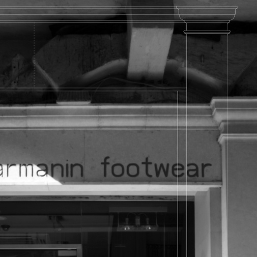
Stanley Cauchi academic studies were mainly concentrated on Baroque architecture, architecture and conservation. Therefore Stanley stated that his main influences in design were mainly directed to the Age of Humanism, Reneaissance and Baroque periods. He also mentioned the fact that in Malta we can find a good number of Late baroque structures. However he also stated that his studies do not reflect his designs directly, rather when designing a project he uses them to sets the basics for his target. An interesting fact about his style is that when he designs or applies some renovations on an old building he tends to use a minimalist style, this technique is done in order to create a smooth contrast, another reason he does so is so that the new extension or alterations do not have a bold impact on the project as a whole.


Above is an example of how the facades are done in old cities with many ristrictions, in this example the shop is lacated in Valletta, meaning that most of the architecture are classical and baroque. Stanley's task is to implement a facade without making a bold impact. In the example above he applies a classical style to the facade, but on the other hand the fact that it is left clean, with out heavy decorative ornamentation's he is including minimalist style making the new facade blend perfectly.   

 His main source of inspiration in designing a project is rhythm, sacred geometry, symmetry, proportion and balance. These were his main topics in his academic studies and went on to be his main foundation when designing. He stated that when renovating, one main source of inspiration is to create a design which can cater for today's needs and to keep in mind that it will provide practical functionality. In fact speaking about functionality a person who really inspired him was Le Corbusier, whom was a Swiss-French architect, designer, painter, urban planner, writer and one of the pioneers of what is called modern architecture. Le Corbusier. He maid an number of projects around the world, ranging from Europe, India, and the Americas. What motivated him most about how Le Corbusier was dedicated to providing better living conditions for the residents of crowded cities, he was also influential in urban planning, and was a founding member of the Congres internationsl d'architecture moderne (CIAM). He also mentioned the master plan fot the city of Chandigarhin in India, and also contributed specific designs for several buildings their. The city was built on the prime ministers demand as he believed it will be the symbol of the nations's faith in the future. 


The five points of architecture
Stanley also stated one of the key architectural techniques which Le Corbusier used in his designs. It was Le Corbusier's Villa Savoye (1929–31) that most succinctly summed up the five points of architecture that he had elucidated in L'Esprit Nouveau and the book Vers une architecture, which he had been developing throughout the 1920s. First, Le Corbusier lifted the bulk of the structure off the ground, supporting it by pilots, reinforced concrete stilts. These pilots, while providing the structural support for the house, allowed him to elucidate his next two points: a free façade, meaning non-supporting walls that could be designed as the architect desired, and an open floor plan, meaning that the floor space was free to be configured into rooms without concern for supporting walls. The second floor of the Villa Savoye had long strips of ribbon windows that allow unencumbered views of the large surrounding garden, and which constitute the fourth point of his system. The fifth point was the roof garden to compensate for the green area consumed by the building and replacing it on the roof. A ramp rising from ground level to the third-floor roof terrace allows for an architectural promenade through the structure. The white tubular railing recalls the industrial "ocean-liner" aesthetic that Le Corbusier much admired.


It was really interesting and knowledgeable speaking to Stanley as he was willing to help and explain what design and architecture really meant to him and his career. I also learnt new things such as the five points of architecture, the way old building are introduced to minimalist styles and also the will that Le Corbusier had to change the way to build our future.  

Tuesday, 31 May 2016

Presentation- Art Deco

In our presentation we included various elements that the style offered to the Maltese islands. Although their are only few landmarks or products that were made during the art deco period. We can mostly find architecture, products and fashion that were influenced by this movement.

My role in the presentation was to research on the style in general such as the characteristics influences and how the movement effected the social life during does days. I also researched on were can still find influences today. My general research about the movement helped the group and myself understand more what we were searching for when we went on our fieldwork. Knowing exactly what the characteristics of the style were helped us easily spot architecture and products that were made under the influence of art deco. I also made substantial research on the influences of this movement to further understand what triggered this style to be so successful in its peak. By observing these influences we could also understand were curtain shapes and forms came from.  Below are the slides I delivered:


I was the first to introduce the style to the audience, i started of by stating the origins that I had researched, the origins involved how society was involved in creating this movement. I also stated what was going on when art deco was born such as the end of the war and the influences it gathered from the machine age. I also stated what other movements influences art deco, such art nouveau, and also mentioned what were the specific characteristics that art deco artist used from this previous movement. In the introduction I also mentioned the pioneers of this movement, such as, Eugene Grasset and Raoul Lachenal and main exhibition they held in paris which eventually would be the starting point of this movement.


In the next slide I mentioned major influences and the impact it made on society. It left a huge impact on Hollywood as a lot of stage designers used this glamorous style for their movies. I also mentioned the materials that were mostly used in these sets and in everyday life. Another factor that i mentioned was the movements that were alive during the art deco period and how they them selves helped shape the movement.


On my third slide u mentioned the events that helped shape up the movement such as the ancient revivals. These ancient revivals included the Egyptian art, roman architecture and also Mayan architecture and arti facts. The biggest event to trigger this movement was the discovery of Tutankhamen, as his discovery triggered mass interest in Egyptian which would later be one of the main influences for art deco.


In my last two styles I gave a brief acknowledgment on what were the characteristics we can find in art deco designs, these included:   Geometric and Angular shapes, chrome, glass, shiny fabrics, mirrors and mirror tiles,   Nature motifs - shells, sunrises, flowers, Highly polished wood.

Overall I enjoyed working as a team an researching on this movement, I believe that this helped us be more familiar with the movement. I was also quite satisfied with my team members as everyone contributed to make the presentation as professional as can be. 


·         
·       
·         

Monday, 30 May 2016

Infographic

Infographic Process  

In order to do task 3 I chose art deco in for my infographic. It is one of my favorite styles as it has a combination of the decorative era and the contemporary modern style. I began by listing down the characteristics and influences of the style. I took into consideration the fact that the info-graphic purpose is to make the viewer easily understand what the topic is without a lot of text, to do this I shortlisted the main influences of the style and also the characteristics that determine the style. My first step was to apply a title, in my case I chose the one below. A neath designed title which i cropped using Photoshop, I also like the colours as they were highly used in art deco. Another fact why it was a good title is due to its typography, a typical typo that was frequently used in art deco.    

  As my title was done I could now easily relate curtain colours I was going to use in the rest of infographic. On the side of the title I added art deco influenced typography that an atrist created presently, I included these at the right and left side of my title, indicating their importance as the style still lives around us today. Although typography is not my specific subject I still think it is relevant to include in my info-graphic as it had a huge role for the character of this style. Another interesting factor is that the artist combined pop art and art deco.  


In the next step I gave colour to the background of the infographic and also applied simple yet effective lines that will act as lining under the wording. I filled the colours of the bar lines using the same colours that the border had. I chose the grey background as the colour was frequently included in art deco fine arts. The grey brownish colour also gave it a slight retro style.
In the next step I included the influences of the style under the title, this was done by using small sized typo so they would not disturb the title. 


By using an online grenadier NF font generator i created my text which included the styles characteristics in a font type that was used during the art deco era. This gave the viewer a clearer picture of the style and could already be recognized by this typo. I placed the wording accordingly on the bar lines. 


Then all that was left was to add appropriate images related to the wording. I chose the images as clear as possible to make it easy for the viewer to understand and visualize. Over all I was quite pleased with the outcome as i believe i managed to translate and help the viewer visualize the style I chose easily. I also made its design as clean and neath as possible to eliminate any confusion. 

Below is the final outcome